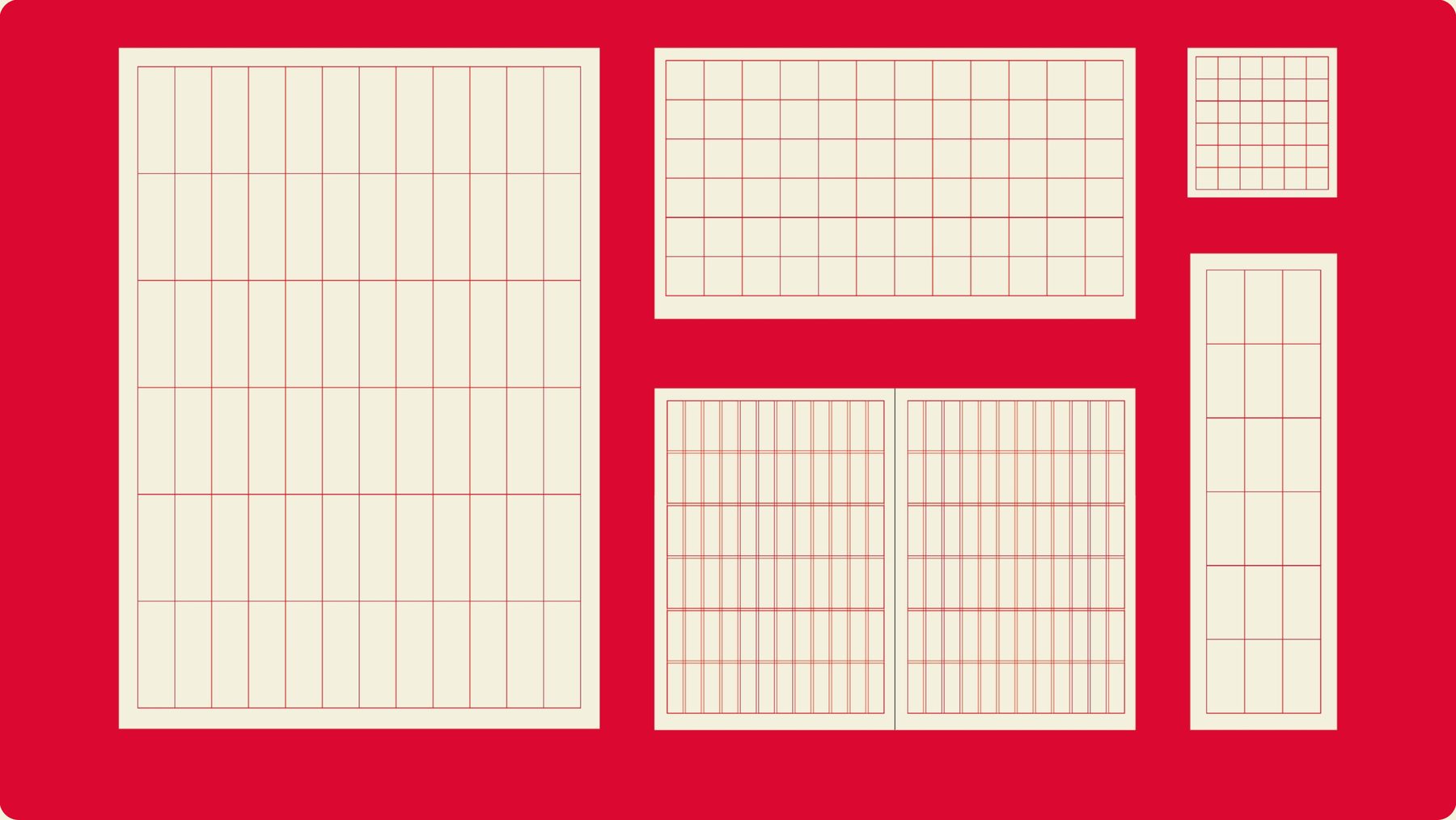
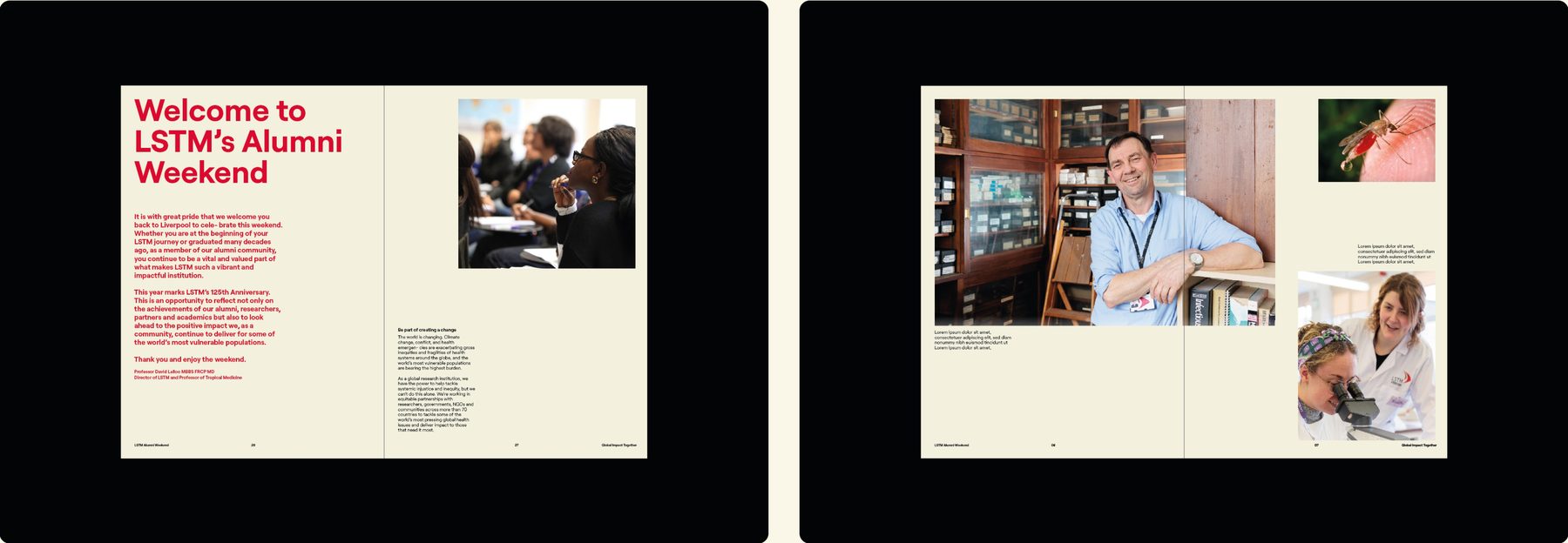
Beneath every design is a hidden grid structure. This gives us a flexible base to align our content to, creating consistency and structure across the design.
You will notice a certain degree of intentional “white space” in these grid structures. This space is left intentionally clear and uncluttered, in order to allow our assets to breathe, and so audiences can absorb the information easily.
| Format | Columns | Rows |
|---|---|---|
| Portrait | 12 | 6 |
| Landscape | 12 | 6 |
| Spreads | 12 | 6 |
| Square | 6 | 6 |
| Long | 3 | 6 |
Portrait
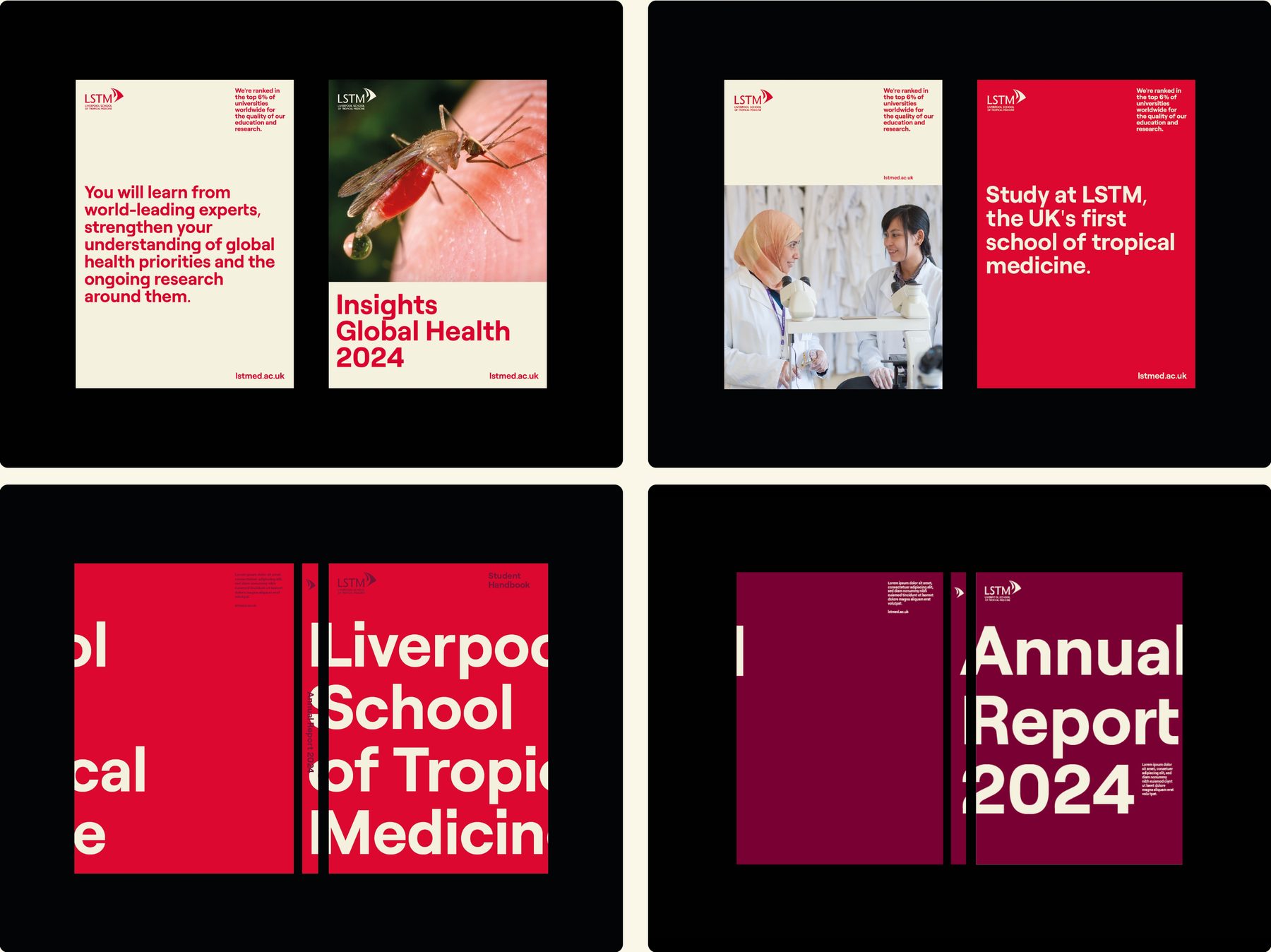
12 columns x 6 row grid. Also note the use of a 1/3 bar device either at the top or bottom of the page. This can be used to hold information when using an image as the hero element. The logo sits top left and then additional information is kept to a column on the right.
Landscape
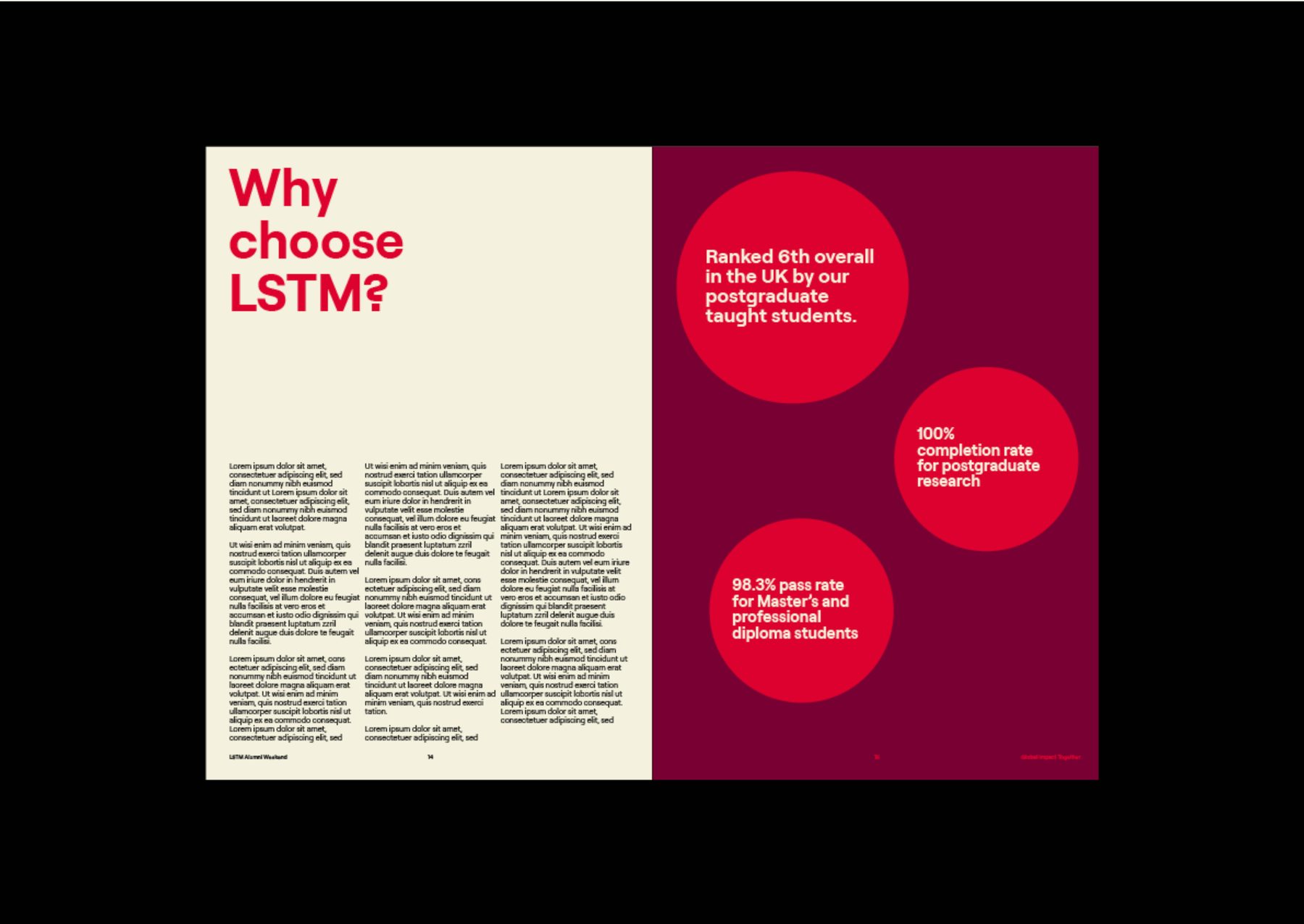
12 columns x 6 row grid.

Spreads
12 columns x 6 row grid.
Square
6 x 6 grid.

Long
3 columns x 6 row grid.